


Yep, you read that title right. Recently, Cap’n Crunch’s box art game has been very on point—and I’m not just talking about the boxes that involve Cap’n Crunch playing actual sports games.
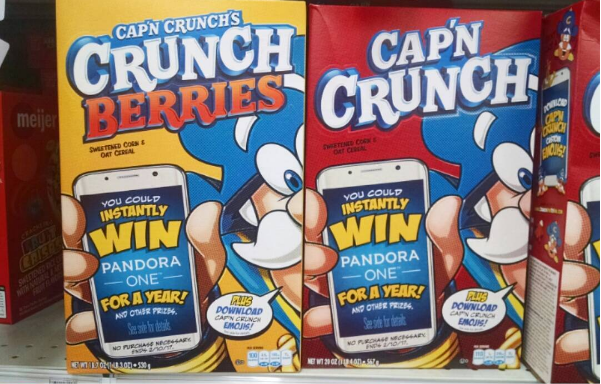
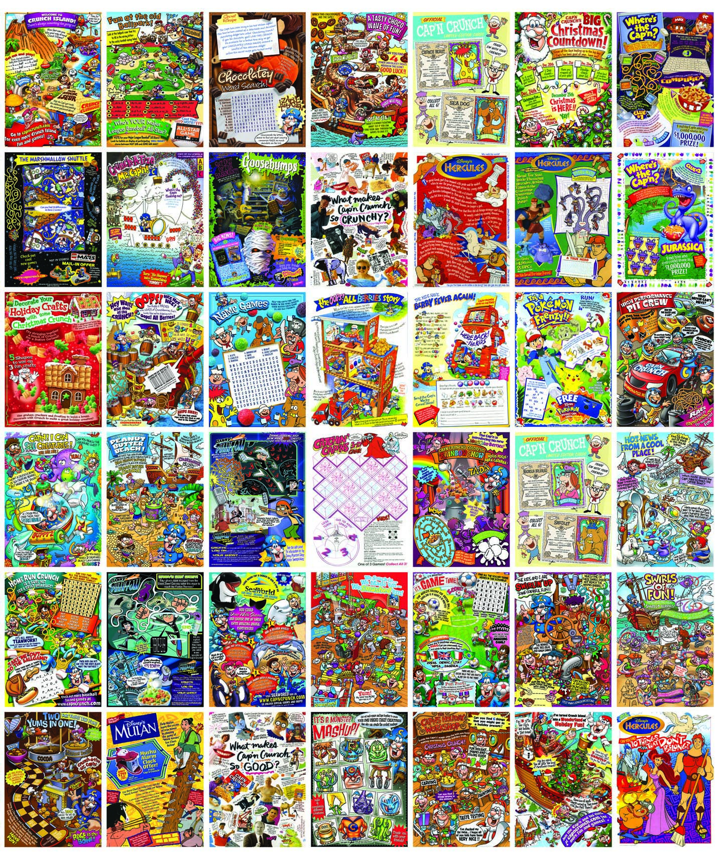
From HomeRun Crunch and Touchdown Crunch to Orange Creampop Crunch and super close-up revamps of classic boxes, the white-haired Cap’n has been looking more spry and animated in 2016 than ever before.
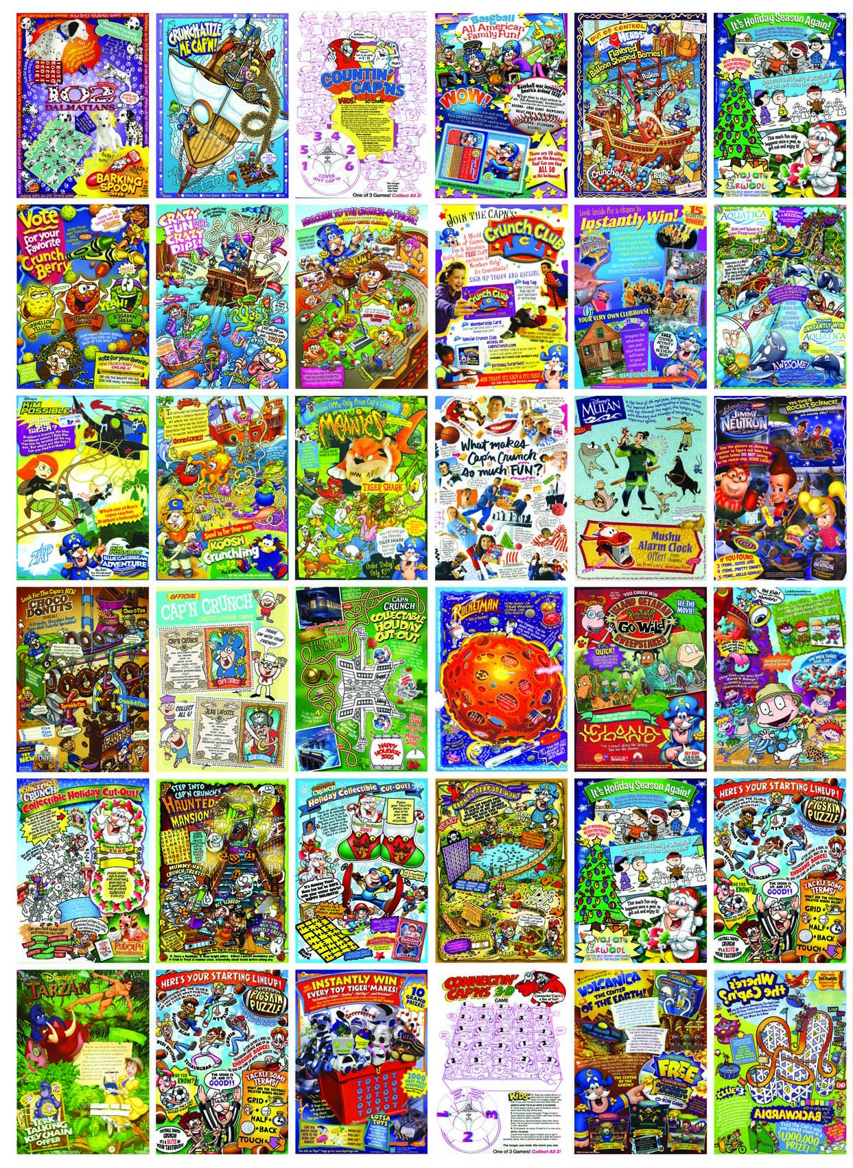
Better yet, the backs of these boxes feature more than just the ever-lively cereal ship captain we know and love. Alongside games, puzzles, a bustling zoo of caricatured animals, and at least one Statue of Liberty, recent Cap’n Crunch boxes have featured countless revivals of vintage Quaker mascots.
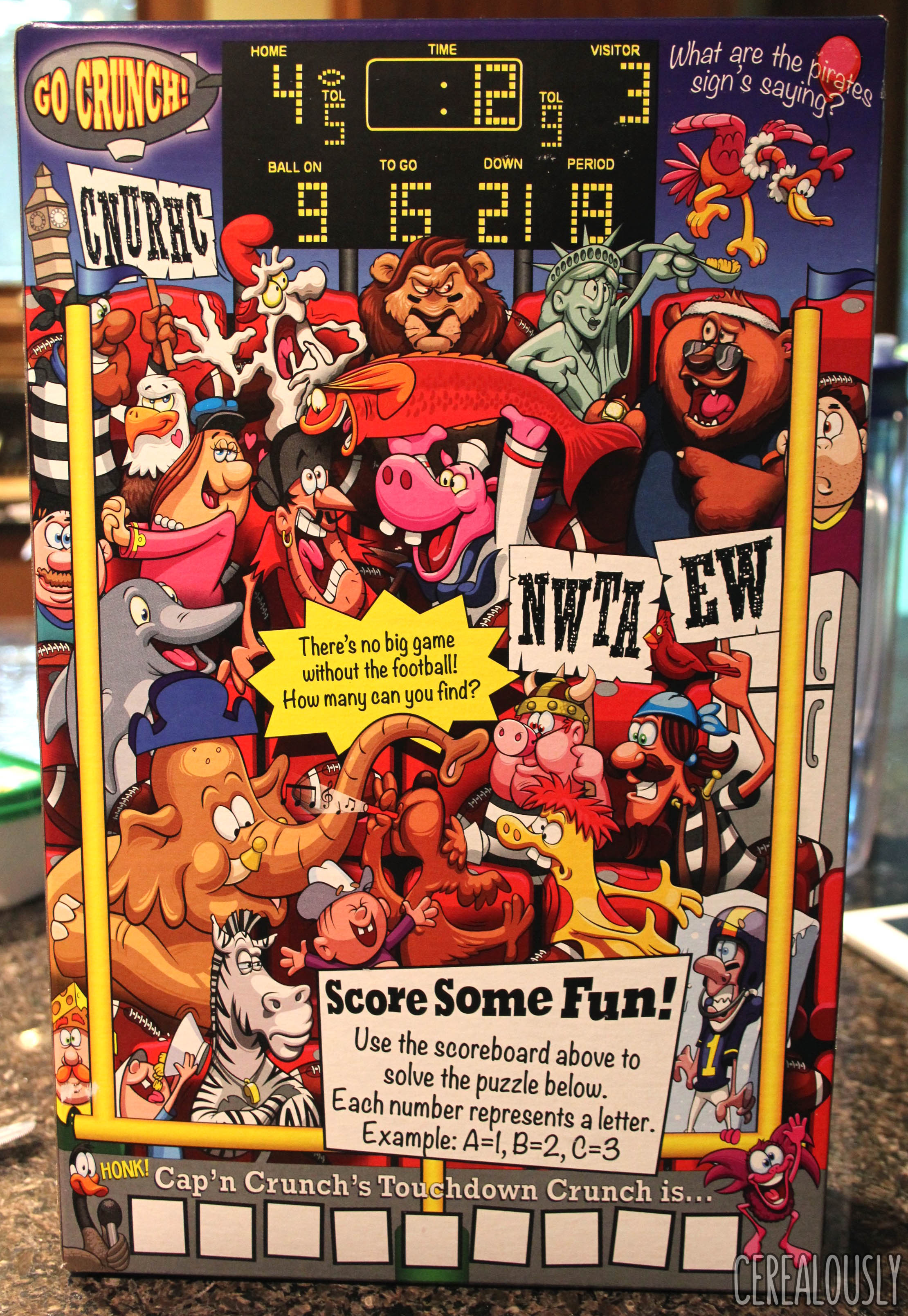
From Crunch mainstays like Jean LaFoote to obscure, decades-old villains like Magnolia Bulkhead, these 2016 boxes have something for cereal lovers from the ’60s, ’80s, and every where (or should I say every when) in-between.
As a serious cereal fan myself, I wasn’t content with just looking at these awesome new boxes. I wanted to find out what was behind this recent Crunchatized revitalization, especially after boxes of Peanut Butter Crunch have featured that same Olympics scene since the 2008 Beijing Games.
Before long, I found out who was behind this shift, too.

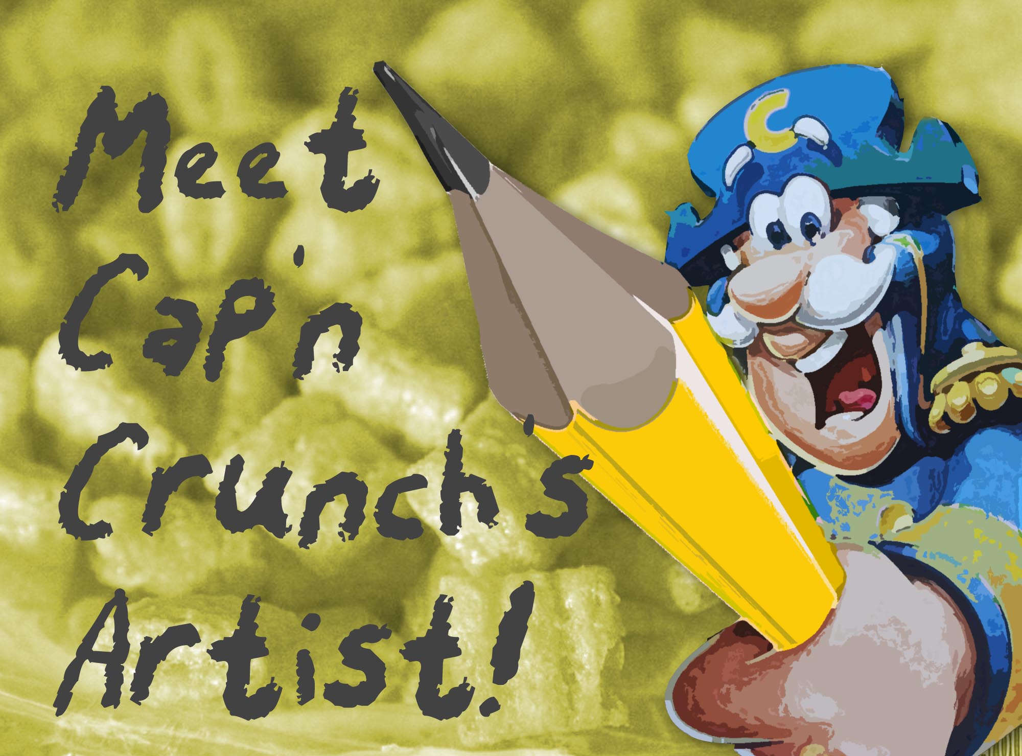
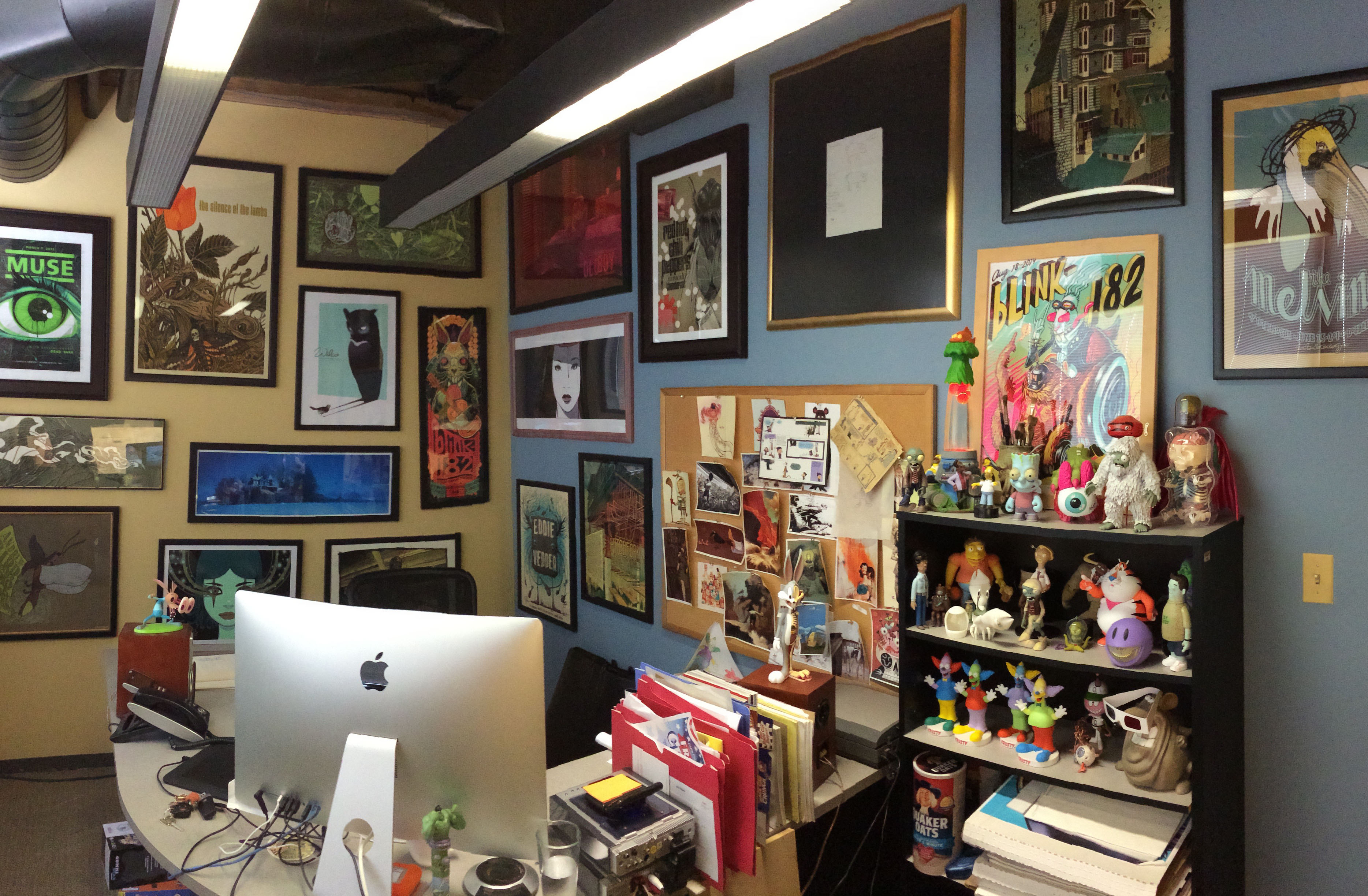
His name’s Ed Griffin, and he’s been Cap’n Crunch’s “personal makeover artist” for decades.
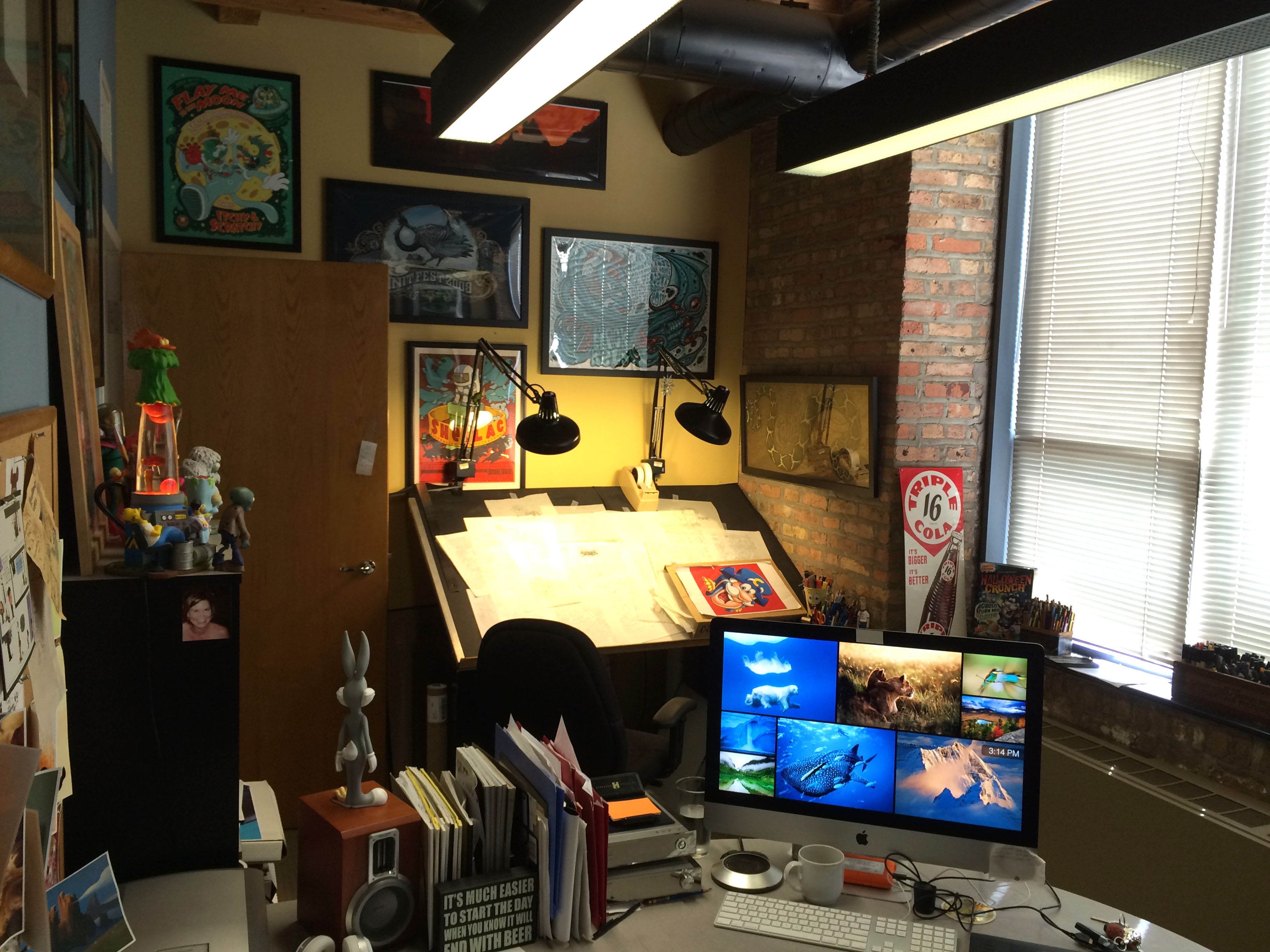
Ed was born and raised in the suburbs of Chicago. He attended Ray College of Design from 1984-86, after which he was hired at an art studio called Feldkamp Malloy. For the past 24 years, Ed has worked at Haugaard Creative, a small but very talented group in Chicago, as the Illustration Director and Senior Designer. Ed and his wife Donna live “waaay out in sticks” with their 10 fish and 2 very spoiled cats: Lelo and Stitch.
And guess what else? Ed is a Cerealously, reader, too! Like an Oops! All Berries box filled with just blue berries, this felt like fate. I took this chance to ask Ed a few questions about his exciting job, and Ed took a break from shading the Cap’n’s eyebrows (or at least that’s what I imagined) to kindly answer them.
He even showed off some his proudest breakfast masterpieces, too.
Cerealously: How did you get in the business of Crunch artistry?
Ed Griffin: Way back in 1986, I graduated from art school and landed a job at an art studio called Feldkamp Malloy in Chicago. There were about 10 illustrators working there, all of which I couldn’t hold a candle to. My future boss, Phil Haugaard, was VP at the time and he had some Quaker Oats work, one of which was Cap’n Crunch. Since 1992, Haugaard Creative and I have been the Cap’n’s favorite shipmates.
Has your own love of cereal influenced your work or career journey in any way? (Bonus question: what was your favorite childhood cereal?)
Absolutely! I always wanted to be an artist, and like most young artists, I wanted to be a cartoonist some day. The artwork and design for cereal packaging in the 70’s was fantastic! It was so imaginative and whimsical, I couldn’t help but be inspired. Cap’n Crunch was one of my favorites, of course, right up there with Grins & Smiles & Giggles & Laughs. The whole concept of a computer-like machine who spits out cereal boxes when he laughed was both bizarre and awesome. Great logo design too: still holds up today.
What is your “creative vision” when drawing the Cap’n and his boxes? In other words: what’s the overall feeling you want to convey with your art?
I just want it to be something fun and engaging to look at. If I can get someone to laugh while enjoying a bowl of cereal, I’ve done my job. A hearty laugh—with a little milk outta the nose is even better.
What inspired the recent turnaround in box design intricacy for Cap’n Crunch cereals?
A lot of factors are involved in redesigning packaging. The Crunch marketing team at Quaker has been very inspiring, as of late. They’ve been very open to pushing the boundaries of the Cap’n’s world in order to appeal to a wider range of consumers.
We’ve learned that a lot of die-hard crunch consumers are adult-aged kids! With that in mind, we’ve started incorporating some pop cultural references and “easter eggs” along with gameplay.
How did you go about picking the characters that appear on the back of the recent Cap’n Crunch boxes? Did you have to do research into old Quaker mascots, or was it based on your own memories?
That one is easy: [I picked the characters because of] fans like you! I’m a pop culture junky and so are many Crunch fans, so why not give a little back to the faithful? Crunch has such a great history that not tapping into that rich nostalgic past would be a crime! I had to do some research, but it was fun research.
Since I’ve been working on Crunch for so long, I’m pretty familiar with most of the characters in his world. There are still some that I have to go online for and do a little digging. I have a great disc I found on Amazon that has a ton of old Crunch commercials, and YouTube is always a solid source for screenshots for reference.
When you’re recreating the old mascots (or the Cap’n himself), what’s the process like?
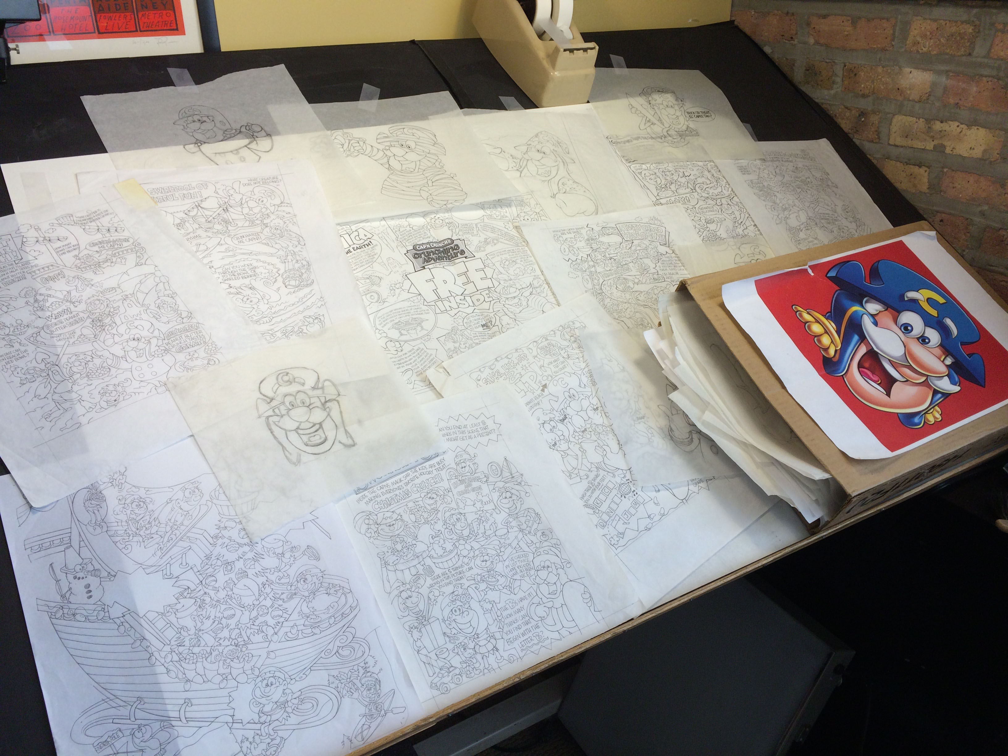
I try keeping the old characters as close to their original style as possible, since the Jay Ward Productions work was so good. Jay Ward was responsible for such great characters as Rocky and Bullwinkle, Dudley Do-Right, Peabody & Sherman, and George of the Jungle.
No need to re-invent that wheel [when drawing]. I still start out the old fashioned way: sketch, sketch and sketch again. When I’m happy with a pose or situation I’ll scan it and manipulate it in PhotoShop some more to get it as good as I can. Even to this day, I still struggle with animation, so having a big box full of all of my past sketches is invaluable!
Who’s your favorite retro Quaker mascot?
No contest: Quisp. I would love to work on some new Quisp packaging. A fan write-in campaign, maybe?
Can you drop us any hints about what’s coming soon from the Cap’n?
“Ahh, patience is bitter, but its fruit is sweet.” —Aristotle.
Was that a hint?
Finally, if you could choose the next new flavor of Cap’n Crunch, what would you choose?
That’s a tough one. How about Campfire Crunch? Chocolate Crunch with marshmallows and graham crackers, of course!
Thanks so much, Ed, for taking the time to provide all this Crunchin’ food for thought. When strolling down the colorful cereal aisle, it’s often easy to forget how much work, research, and bona fide cereal love goes into the box art we stare at each morning. As smartphones and tablets become increasingly attractive eye magnets, it’s relieving to know that some people are still dedicated to the fine craft of cardboard art.
Now if you’ll excuse me, I need to ponder that Aristotle riddle and find out what’s next from Quaker. Strawberry Greek Yogurt Crunch, perhaps?
I was trying to remember the name of the original artist that did Captain Crunch. He is about 75 or older now. Good artist. He did the first one.
I think it was Roy Patterson – Feldkamp-Malloy Advertising
I sat down for breakfast this morning with my favorite peanut butter crunch and noticed that the “games” design has changed. Of course my first thought is that somebody’s feelings got triggered and you were made to change it. For those that didn’t catch it, the Canadian went to the dentist and got his two front teeth back. I personally got a chuckle out of it. Just wondering what the reason was.
Ed! You are a gentleman and a scholar! I’m a huge fan of your work, especially all the new retro mascots. I gave you a shout out in my Cereal Time video about Touchdown Crunch (New Fall Cereals) and I hope more people become familiar (and excited by) your work.
Lastly, CAMPFIRE CRUNCH sounds AMAZING! I really hope the people at Quaker read this and decide to take you up on that!
(And to Dan, I wouldn’t too much into that Aristotle quote. Though I am kinda hoping it was a hint for a sweet, fruity variety coming soon. You know what else would be amazing: Gingerbread Cap’n Crunch.)
Oh yeah: gingerbread on everything!
Super fascinating (and unique) interview! I’ll be sure to take a moment to appreciate all of the packaging art when I next go shopping :).
Props to both Ed and Dan!
Great interview Dan, nice to get a peek behind the scenes. Keep up the amazing work Ed!
Thanks John, I’ll keep pluggin’ away!