


Yes, I was indeed only sent an (empty) miniature box. I guess now I can use it to hold…belly button lint?
When I got an email about a secret Cinnamon Toast Crunch surprise coming to my house, my mind swirled with possibilities:
Peanut Butter Toast Crunch’s return?
The early merriment of a new Gingerbread Toast Crunch?
Ooh, or maybe a personal Cinnamon Toast Crunch feeding trough, with two sides so me and the boys can chug some endmilk and also dispose of it baseball stadium style?
Unfortunately/hygienically, it was none of the above, but instead a rousing rebrand of the Cinnamon Toast Crunch we’ve come to know and love (by which I mean immediately recycle as the cereal inside evaporated into the no-longer-thin air of my esophagus).
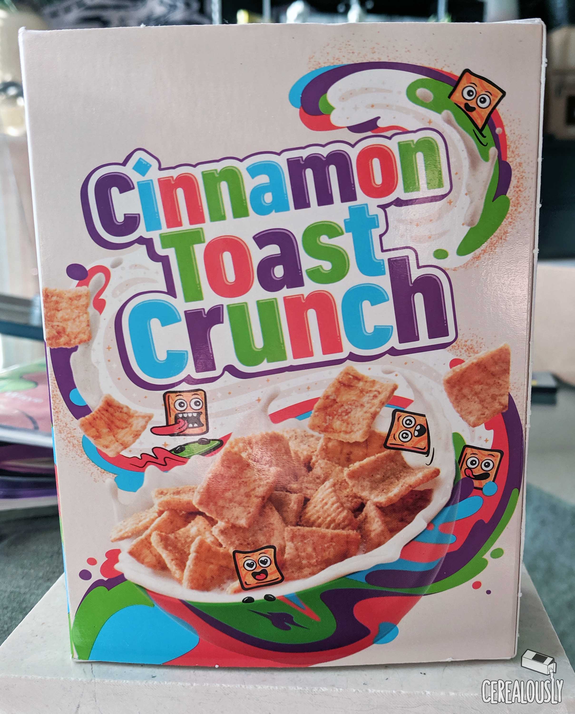
My thoughts on the new design, including its now-emojified and less-sociopathic squares? It has its ups and downs.
The new mascots themselves just don’t sit right with me. I get that emojis are pretty much pictographic accents, but this looks like they were sort of pasted onto the box like a kid committing the mortal sin of slapping a few Goofy stickers on the side of his mom’s sedan.
May he rue the day he unleashed the scourge of residue.
But besides the boys in beige, I like the rest of what General Mills did with the Cinnamon Toast Crunch color palette. I’m getting serious Splatoon vibes from the iridescent puddles of liquefied CTC Pantone swatches, and I can only wish my own cereal milk was painted with such a powerful technicolor dream coat.
So what do you think of it? No word yet on how this branding might extend to the other Toast Crunch properties, but if Sugar Cookie Toast Crunch makes its triumphant return come December, I hope the Cinnamojis at least bring some of my favorite emojis over for dinner.
🥥🐌🍣🦑🍖🐄
Hmm, on second thought, maybe I shouldn’t be in charge of the entrees.
no way bring Wendell back please
Cinnamon Bob Square Cereal.